-
Task
-
Resolution: Unresolved
-
Major
-
None
-
None
-
False
-
-
False
-
---
-
---
Motivation
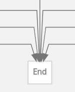
The way incoming end (state) connectors are being represented, in case several exist, is not looking nice.
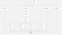
Consider this example, where several states are targeting end:
So the end (state) is displayed as:
Goal
Improve the visualization for end (state) and/or incoming connectors.
Proposals:
- Do not attach the ending connectors to the same state magnet (point)
- Or use center magnet instead (auto_magnet=false)
- Or attach to different cardinagnets, in a hardcoded way (W, E, T)
- Increase the width for the end (state) depending on the number of input connectors
Acceptance criteria
The target node's magnets are created dynamically.
Node Edges are chosen based on: TBD
The space between magnets is: TBD
- is incorporated by
-
KOGITO-8100 SWF Editor - Auto-layout improvements
-
- Open
-

