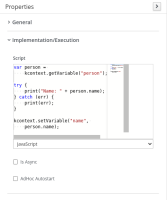
When editing the on entry action of a node, there seems to be now a highlight/overview section that takes up more than half of the space available. Making it quite difficult to visualize the content. Also the script's authoring area is not resiable.
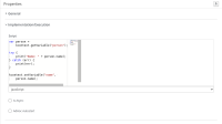
Default size, which results "small" for common script editing goals:
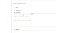
On expand, the script area is not even expanded:
Acceptance Criteria
- Do not show show the minmap (at east side), in oder to have as much available space for script editing area
- Expand the script editing area as much as possible, given the default size for the Properties panel
- Make the script editing area resizable - once the Properties panel grows, the script area must grow proportionally as well


