-
Bug
-
Resolution: Done
-
Major
-
4.9.0.AM3
-
devex #155 September 2018
-
8
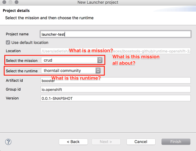
The launcher wizard that we implemented in 4.9.AM3 works but it lacks explanations that would help a novice user.
Suggested improvements:
- A novice user has no idea what a mission is all about. We should maybe add an explanatory label that tells the user what he's picking with a mission. And then we should explain what the mission that he has chose will provide.

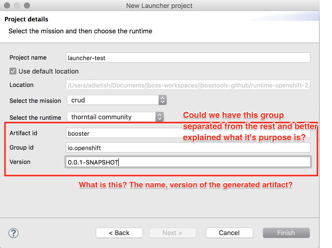
- A novice user has no idea what the maven artifact elements are for.

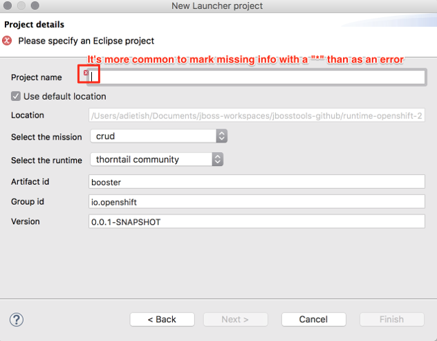
- Generally speaking it is preferable to decorate missing input fields with a "*" than to mark them as errors (as one can see in most web forms). OpenShift tooling does this as a rule of thumb.

- Location is not decorated with an "required value" (or error) marker

- relates to
-
JBIDE-26165 Implement a Launcher project wizard
-
- Closed
-