-
Enhancement
-
Resolution: Done
-
Minor
-
4.5.2.AM3
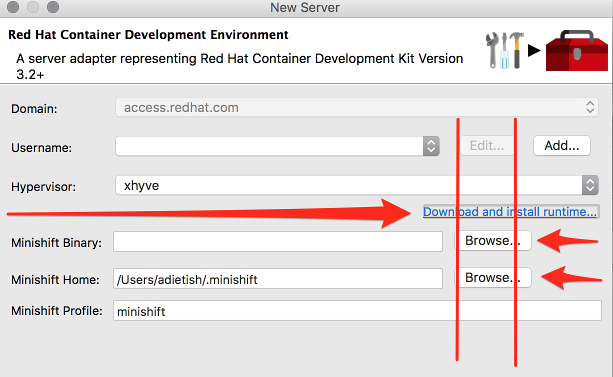
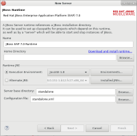
- "Browse"-buttons are not aligned to anything else. They should span to the right border of the form
- All buttons have disparate sizes, there's no consistency
- "Download and install runtime..." should be starting at the left border of the form, because that's where you're looking at when looking at the form: you start on the left upper corner, look at each line starting on the left and going to the right.


