-
Enhancement
-
Resolution: Duplicate
-
Critical
-
4.2.0.Beta2
-
None
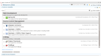
With current implementation, Early Access section on Software/Update page could be easily overlooked.
If this section could be moved few pixels higher and collapsed by default, user would have not to scroll down to notice that there is something on the bottom.
Now it seems to me that we are hiding this from the user.
WDYT?
- is incorporated by
-
JBIDE-17392 Early Access button accessibility/visibility
-
- Closed
-
- is related to
-
JBIDE-17527 revise Early Access disclaimer copy
-
- Closed
-
-
JBIDE-17392 Early Access button accessibility/visibility
-
- Closed
-
