-
Enhancement
-
Resolution: Done
-
Major
-
10.1.0.GA
-
devex #127 February 2017
-
5
-
NEW
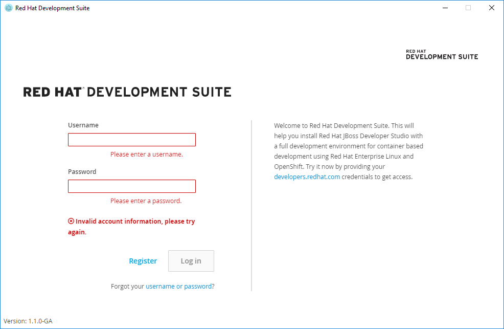
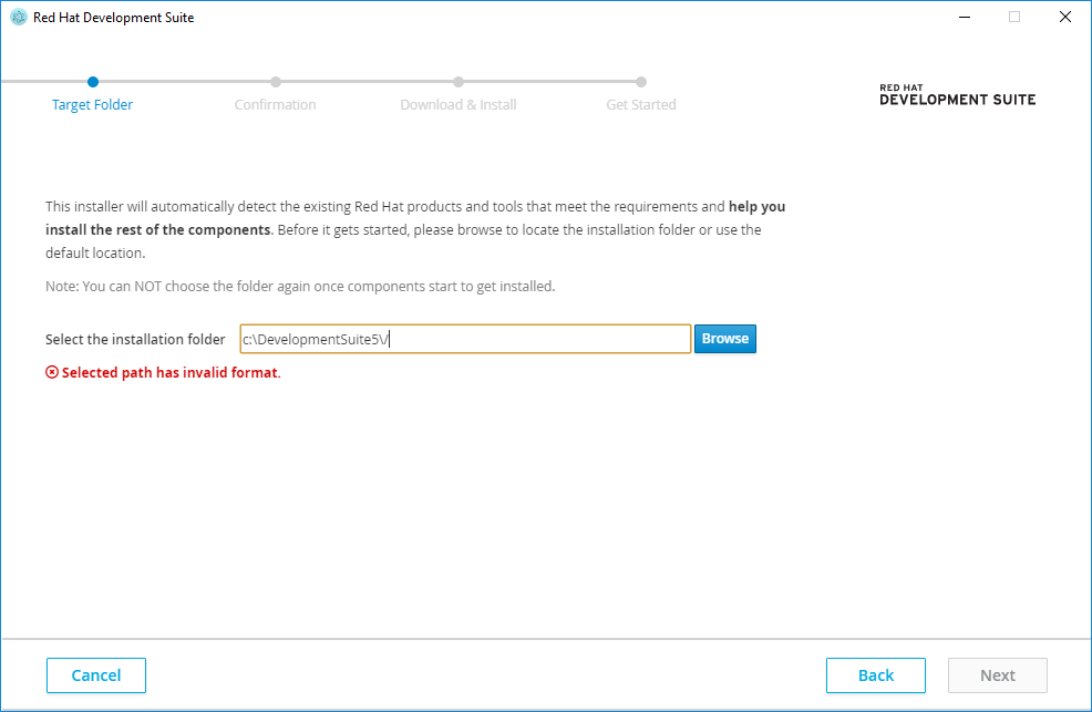
Account page looks different from Target Location page:
1. Fields with invalid values have red glow border with gradient;
2. There are three areas to show error messages one for each field and one for login error;
3. Username and password error have styling different from login error and from validation messages on Target Location page;
4. Field height is different from Target Location field;
5. When validation messages appear they move elements on Account Page back and forth;
To Do:
1. Always show only one message between fields and buttons
2. If username and password are empty show error message: "Please enter your username and password"
3. If username is empty show error message: "Please enter your username"
4. If password is empty show error message: "Please enter your password"
5. Show only one message at a time, if there is "Invalid account information, please try again" message and password or username is changed hide error message.
Account Step:

Target Location Step:
 :
: