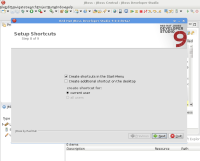
The icon used for the installer is a more-or-less solid red ball, but the icon for the JBDS app is a red ball with while circles through it.
Unless this is a quirk of the way that izpack compresses/displays the icon, we may be using a different one for the installer than the app.
This may also be an intentional design choice, so that if you're running JBDS and an installer you can tell which is which visually.
Screenshot showing an installer dialog superimposed over JBDS:
![]()
Should we change this?

