-
Epic
-
Resolution: Done
-
Major
-
None
-
Improve the first screen of Launch
-
To Do
-
0% To Do, 0% In Progress, 100% Done
-
True
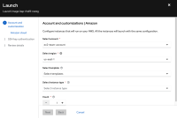
The first screen for AWS/GCP has a scrollbar by default:
Templates dropdown overflows:
Instance types dropdown overflows even more:
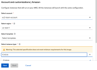
If you select unsupported instance type, the warning pushed components even further to the degree that the page is unusable:
This needs a proper solution. We looked into ability to enlarge the form but we have found out this is the biggest possible size. We looked into hiding the top text, but does not make a big difference.
Consider splitting instance type into a separate screen, it could be useful for first time users to have space to describe hyperscaler families.


