-
Enhancement
-
Resolution: Done
-
Major
-
None
Priority level: could
The same with: https://issues.jboss.org/browse/EAP7-228
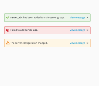
Attached is the suggestion for the notifications in the most recent prototype. Currently, users can click on the bubble to view the detailed message in a model window. But according to the usability test results, some users didn't know the bubble is clickable. This is why the link "view message" is added.
Also made the object names bold and included the new icons that are recommended by PatternFly. To find the new icons: https://www.patternfly.org/styles/icons/cheatsheet/
