-
Story
-
Resolution: Done
-
Undefined
-
None
-
None
-
None
-
3
-
False
-
False
-
None
-
HAC Dev Sprint 235, HAC Dev Sprint 236
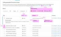
- I'm not sure what the default sort is, none of the columns show a selected sort when the page loads
- I can only expand a row by clicking on the arrow, it would be nice if the click target was larger. perhaps clicking the rule name could also expand its row?
- summarizing how many pass/fails/warnings could be beneficial for at a glance digestibility as this scales across rules and multiple components
- effective on isn't that useful right now. will it be more helpful in a production setting, or should we look at removing it from the column here, and making room for other information (like the failure message)?
Acceptance criteria:
- make external icon size small
- short status column by default
- make the expandable click area bigger
- show the result summary as per UX
- surface collection on the expanded row as per UX
- remove `effective from` column and show `effective from` in expanded row
- show failure message in the table column, remove from expandable section. Truncate longer failure message and show them in tooltip
- relates to
-
HAC-3691 Enterprise Contract security tab feedback & UI suggestions
-
- Closed
-
- links to
