-
Bug
-
Resolution: Duplicate
-
Normal
-
None
-
1.3.0
-
False
-
-
False
-
-
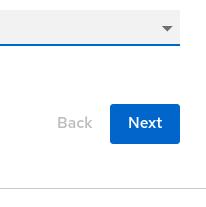
Description of the problem: In order to be visually consistent with other buttons that are side by side in RHDH, we should add a space between the "Back" and "Next" buttons in the workflow execution screen:

In the software template creation screen, the buttons have a space:

and in the workflow instance screen:

In addition, the disabled "Back" button should be grey to match the other disabled buttons' color.
How reproducible: 100%
Steps to reproduce:
1. Deploy orchestrator 1.3 rc4 with latest rc3 plugins
2. Execute greeting workflow.
Actual results: See above
Expected results: Buttons should be visually consistent.
- is duplicated by
-
FLPATH-1884 workflow input - button padding
-
- Closed
-


