-
Enhancement
-
Resolution: Unresolved
-
Major
-
None
-
None
-
None
-
NEW
-
NEW
I understand that:
there is a JIRA somewhere on AppFormer to move the "Notifications" to follow Pattern Fly design (which is used by, for example, EAP/WildFly too).
but
the green ones however are Stunner.. and IDK if there's one there..
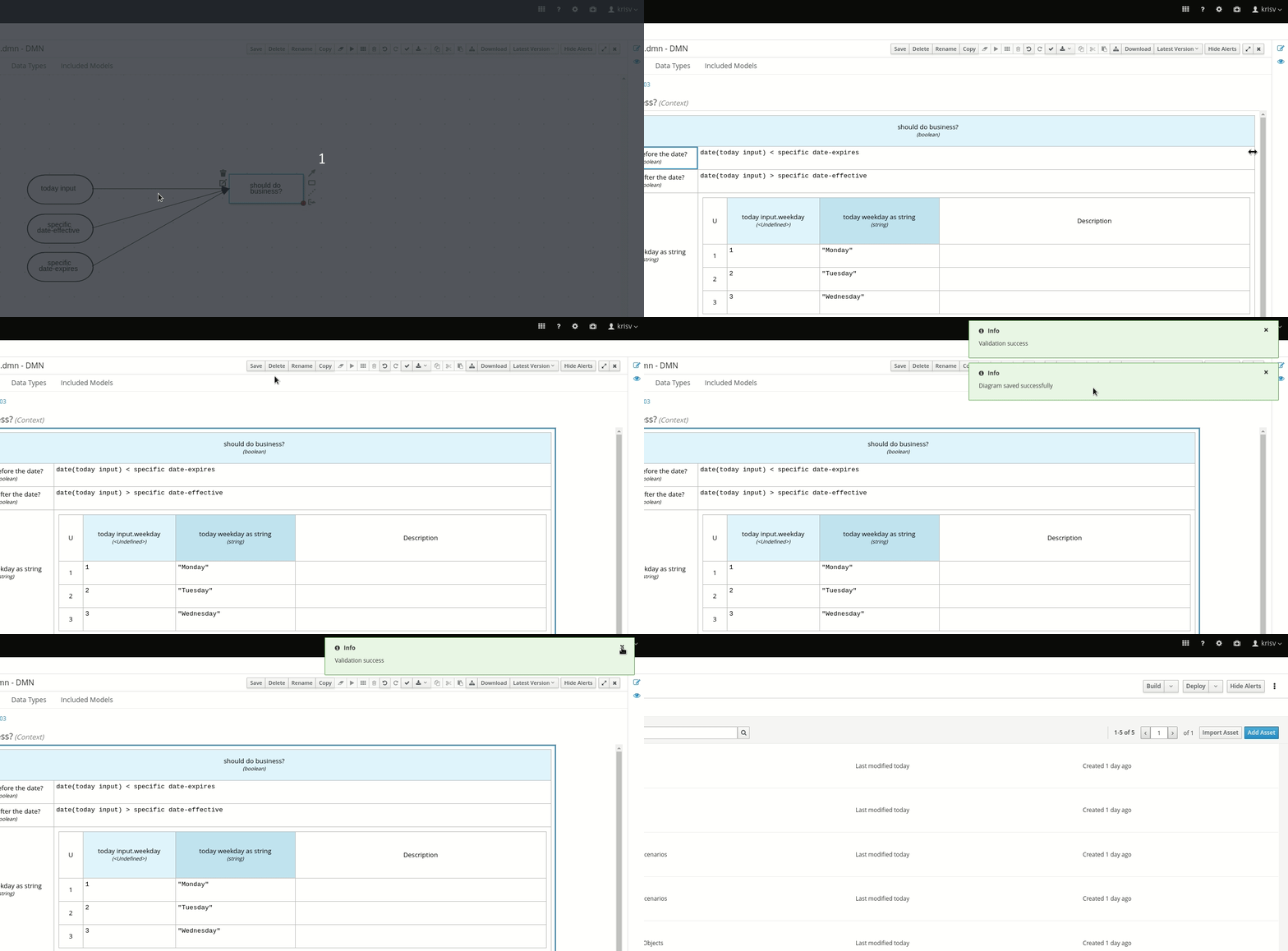
as demonstrated here:

Personally I become quite fast in clicking the X on those green popups, but it is becoming a bit annoying exercise ![]() can you kindly consider if there is a better UX/implementation way, please?
can you kindly consider if there is a better UX/implementation way, please?
