-
Enhancement
-
Resolution: Done
-
Major
-
7.13.0.Final
-
2018 Week 42-44
-
1
-
NEW
-
NEW
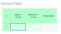
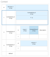
etirelli requested greater visual contrast between InputClause and OutputClause columns.
this is way too subtle, to be honest... can we get colours that are a bit more distinguishable?
See the attached screenshot.
Additional note for clarity, goal is to: clearly differentiate between different blocks of columns (decision table: input column, output column plus possibly a third "general" type.)
- is related to
-
DROOLS-3162 Resolve Table (grid) width for Scenario
-
- Closed
-
-
DROOLS-3164 Modify grid colors to match UX requests
-
- Closed
-
-
DROOLS-3163 Add toolbar controls for editing the table.
-
- Closed
-


