-
Enhancement
-
Resolution: Done
-
 Major
Major
-
None
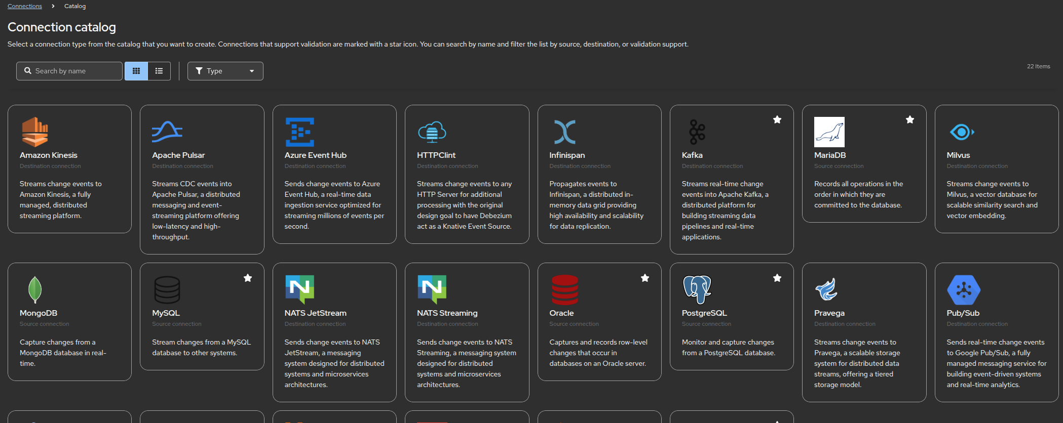
As an example, when navigating to the Connections > Catalog screen, shown here

While the rows and columns are uniform, their respective content isn't. I believe it would look more professional if we made sure that the box border always used the maximum cell height so that each box is presented in a consistent way.
There are other places, such as Source > Catalog, Destination > Catalog, and likely others I have not yet explored through that could benefit from this small design improvement.