Uploaded image for project: 'Debezium'
  1. Debezium
  2. DBZ-1668

Superfluous whitespace in intra-level ToC sidebar

XMLWordPrintable

    • Icon: Task Task
    • Resolution: Done
    • Icon: Major Major
    • 1.1.0.Beta2
    • None
    • documentation
    • None

      We were discussing this before, but I still see room (literally, ahaha) for improvement. See the following screenshot:
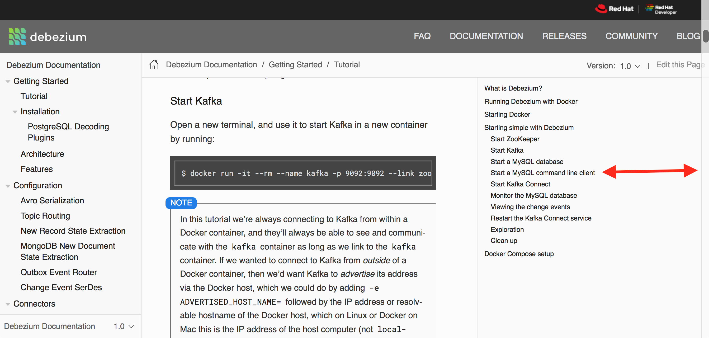
      If all that extra white space on the right were removed, the actual text would have much more space and would be better to read.

        1. whitespace.png
          490 kB
          Gunnar Morling

              ccranfor@redhat.com Chris Cranford
              gunnar.morling Gunnar Morling
              Votes:
              0 Vote for this issue
              Watchers:
              3 Start watching this issue

                Created:
                Updated:
                Resolved: