-
Story
-
Resolution: Done
-
Normal
-
None
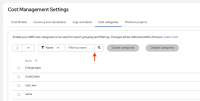
During a design review of Cost Management with PatternFly v6 rc1, it was noted that our legacy filter inputs don't look correct. Rounded corners appear between the filter input and search icon, along with extra spacing.
The UI currently implements an older pattern which groups PatternFly TextInput and Button components together. When there is no type-ahead support, this pattern is used as a filter input with a search icon on the right. In preparation for the PatternFly v6 release, this legacy pattern should be replaced with PatternFly's Search component.
Note that this does not effect type-ahead filters, since the search icon already appears on the left. Only filter inputs which, don't support type-ahead, shall be updated.


