-
Bug
-
Resolution: Unresolved
-
Normal
-
None
Description of problem:
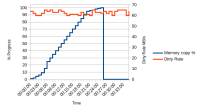
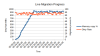
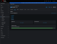
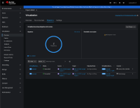
The graph intended to represent information about the migration process does not display the information correctly. (In my opinion)
Version-Release number of selected component (if applicable):
4.14
How reproducible:
Always
Steps to Reproduce:
1. Do few live migration
2. See if it make sense
Actual results:
Expected results:
As user/cluster admin, I care about the indeviduals migration, so I expect to clearly see when a migration start, how much data is left to migrate, the migration rate.
Also the dirty rate have diffrent unit, which should not share the same Y-axis with data processed.
Also, it seems the matrics just keep piling up, a small VM which 2G RAM can show with 5TB data processed, after several migration. Which makes the graph less understandable and intuitive.
Additional info:
Included a screenshot, for example, you would assume "Data remmining" will start high, and go down as you advnace, but that is not the case.
- depends on
-
CNV-37525 Report VM migration metrics with granular timestamps
-
- Closed
-
- links to
- mentioned on
(3 mentioned on)


