-
Bug
-
Resolution: Done
-
 Undefined
-
CNV v4.13.0
-
None
-
Quality / Stability / Reliability
-
0.42
-
False
-
-
False
-
-
None
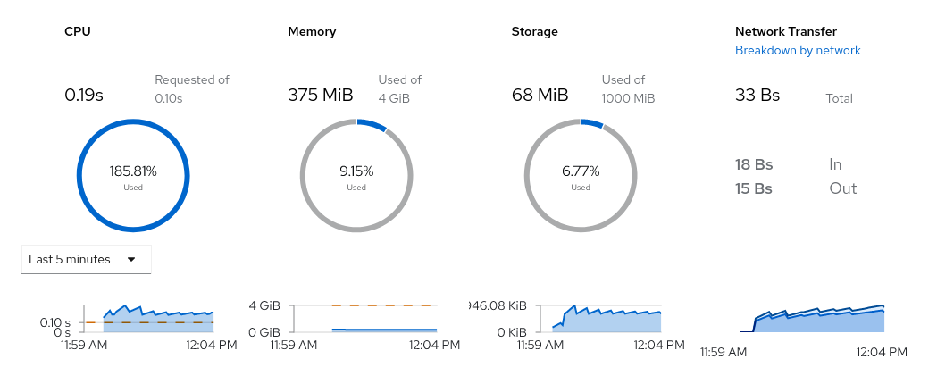
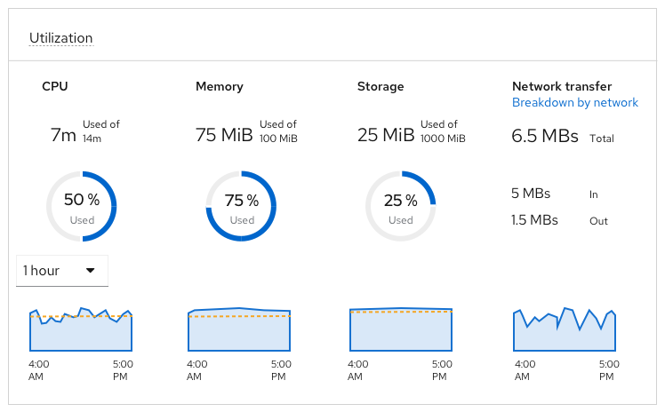
The small line charts around metrics (cpu, memory, storage) specifically, are difficult to read. Or rather look cramped.
What about removing some axis legend (i.e. y axis), like i.e. it's done for network (or is this a bug?).
Or change the font size, or rotate the text.
Or in general give them more space?