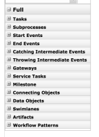
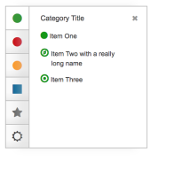
- Don't like black and white icons, no description, etc.
- It's not intuitive, it's very difficult to know what elements are inside what tab.
- There are too many elements in the same tab.
- The old Designer palette is really better than the Stunner one.
There are no Sub-Tasks for this issue.


