-
Bug
-
Resolution: Done
-
 Critical
-
None
-
None
-
None
-
False
-
-
True
-
-
-
OCMUI Team Sprint 279
Environment: stage/prod
Url: a cluster details page like https://console.dev.redhat.com/openshift/details/s/35KpoBGR8SmAjvC8PDP0aQINtY4/#overview
Browser: Chrome 141.0.7390.108 (Official Build) (arm64)
OS: MacOS 15.7.1
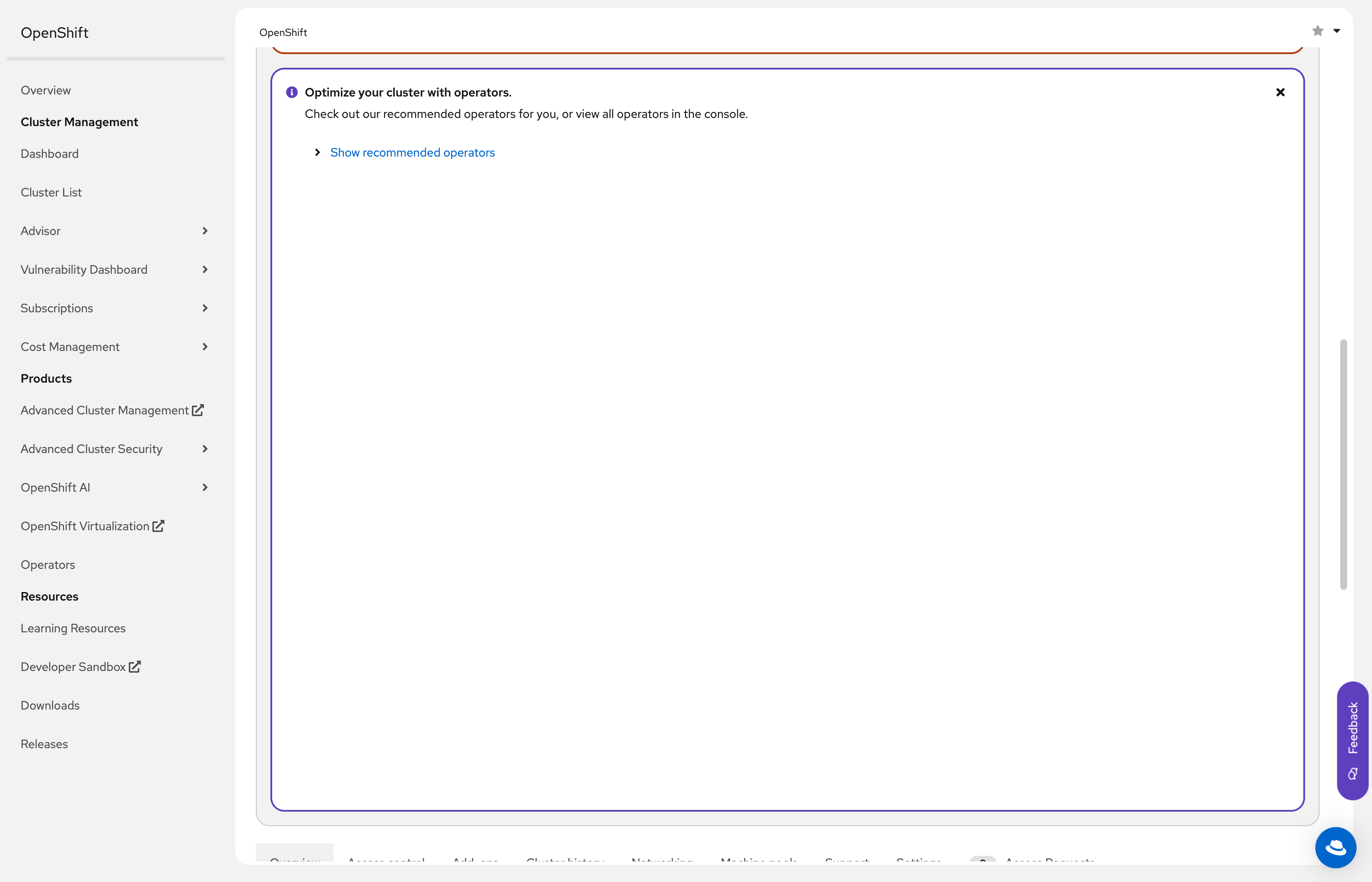
Reproduction steps:
- open a cluster
- expand the "Alerts and recommendations" alert
- scroll down until you find the "Optimize your cluster with operators." alert
Current Result: The recommended operator section is taking all the space that it would take when expanded even if it's closed. See screenshot
Expected Result: The section content is collapsed and it doesn't take more space than it needs
More information:
Turns out this bug comes from PF, and opened a Github issue to fix it (The expectation is Q4): https://github.com/patternfly/patternfly/issues/7990
- links to